Humor is mankind’s greatest blessing. – Mark Twain
As a person with a disability I could have lost my sanity a long time ago, if not for my sense of humour. Experiencing inaccessibility on a daily basis is a constant frustration, but every now and again I see an example of an epic fail in regards to accessibility and I just can’t help but laugh. How, I wonder, did this make sense to someone? Following are some examples of extreme fails for ramp accessibility. I may not want to run into these in my daily life, but seeing them on my screen allows me to see the humour in how badly people understood the purpose of the ramps they were creating. I hope you see the humour in it as well. Hopefully by sharing these, we can, in a fun way, educate about the need for well done accessibility; accessibility that actually offers access to people with disabilities. Imagine a person who uses a mobility aid (walker, wheelchair, scooter) or a parent with a stroller trying to use these “accessible” features; unfortunately they happen more often than one would think.

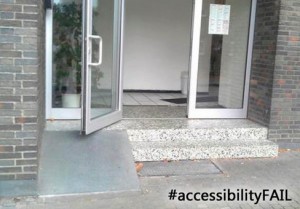
Here is an example of a ramp being provided, but access into the building still being denied. Oftentimes accessibility features are added without full consideration as to whether that particular piece of the puzzle leads to further accessibility. Someone with a mobility device can get up this ramp, but it doesn’t look like there is even enough space on the top step for a mobility device, and even if there were, there is no way to access the entrance as the open door blocks the ramp and top step. They need to reverse this door, so it opens to the right, or make it a push entrance. Seeing this, I can’t help but shake my head and wonder at how it ever made it beyond the planning stages.

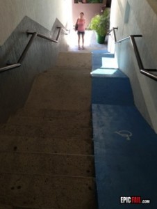
“Why yes, we do have a ramp for people with disabilities. It is clearly marked.” No mention of the fact that you need to be a daredevil in order to use this ramp! Yes, it is well marked with the international symbol of accessibility, and it is painted blue (which is considered to be the appropriate colour to highlight access features), but how many people have actually used it? Having a ramp doesn’t mean it succeeds in the purpose of the ramp being usable. Simply paving over steps does not make a ramp. The crazy part of me would love to try this ramp, but then I think my body has enough going on without adding additional injuries caused by a ramp made more for skateboarders than people with mobility devices.

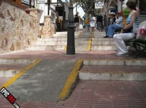
It is nice that a ramp was created for these stairs, however, did they have to choose the one spot that leads directly to a lamp-post? Looking at this ramp, I wonder which came first – the ramp or the lamp? With space on either side, why was the ramp centered to the one spot where there was a barrier? Barriers negating the usability of accessibility features, such as this ramp, are often overlooked, even if it seems obvious to anyone who needs accessibility. Again, how did this possibly get beyond the planning stages? And when the people put in the ramp (or lamp) did they not see a problem? How many people worked on this project without seeing this lay-out as an issue?

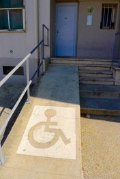
Oh, they were so close! They built a ramp that is flat and graded well, not too steep, but then they quit before the job was done. Did they run out of energy? Time? Money? It’s super frustrating to see them come so close to a usable accessibility feature, just one step away, and then… nothing.
Knowledge of accessibility is learned, usually because of a personal need for it, or the need of someone you know. When people do not have a daily need for accessibility is can be easily overlooked or misunderstood. And while some people think of accessibility features, they fall short in the final design, as these photos have proved, often because they did not consult with someone who has experience in Universal Design. Please, if you are going to create an accessible feature, do your research, talk to future users, and make sure your design does not replicate these photos!